Clarity first
Readable obstacles, friendly colors, and instant feedback on every tap.
CluckDash is a playful chicken game designed around clarity, fairness, and lightness. We keep controls crisp, sessions short, and rewards understandable — so every run feels like a small win.

The pillars we stuck to while shaping CluckDash — clarity, fairness, and lightness at every step.
Readable obstacles, friendly colors, and instant feedback on every tap.
No pay-to-win shortcuts. Skill and timing shape scores — not purchases.
Small install, optimized textures, and considerate battery use.
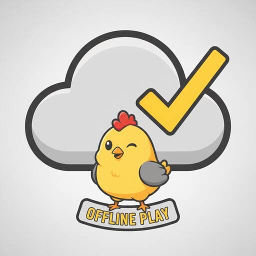
Core sessions run without signal. Progress syncs when you’re back online.
Visible focus states, keyboard-friendly UI, and motion-respectful effects.

Short sessions, honest rewards, and playful cosmetics with zero pressure.
How a small idea turned into CluckDash — a cheerful dash built for clarity, fairness, and lightness.
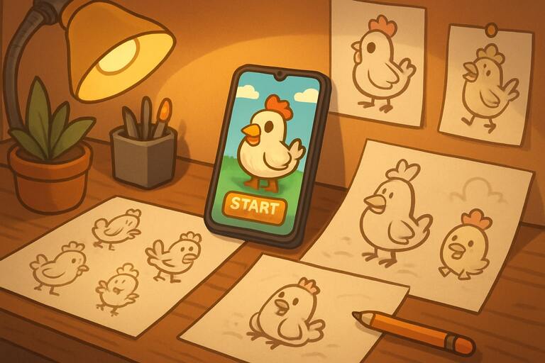
We sketched a playful lane with readable silhouettes and quick taps. The goal was simple: fun in a minute, not a manual.
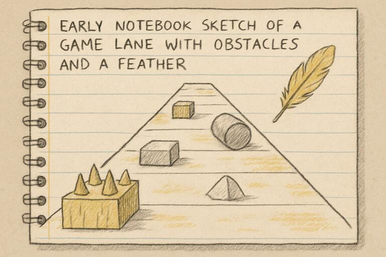
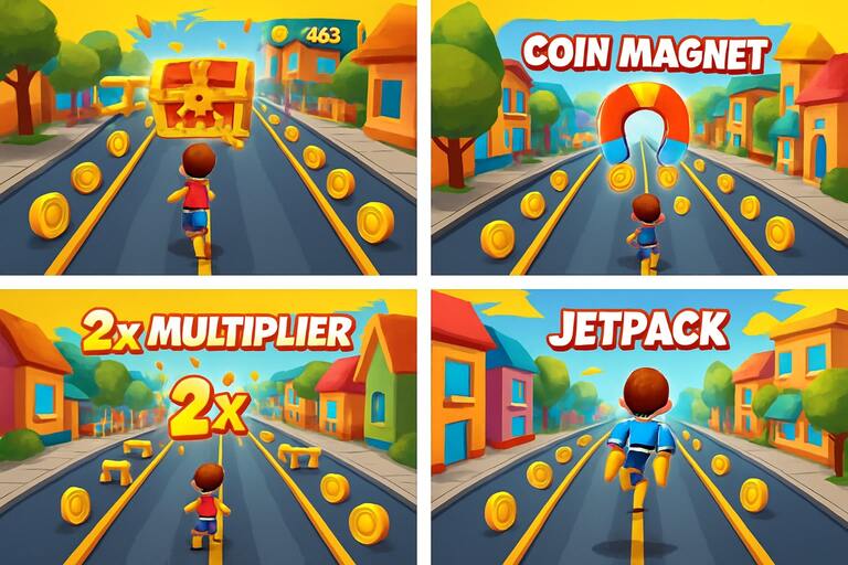
The first prototype proved the core loop: tap to dash, swipe to weave. Short, readable sessions made smiles automatic.

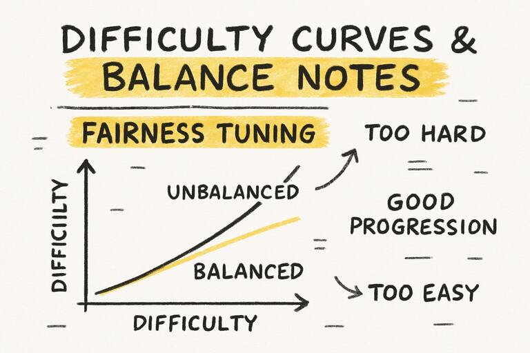
We trimmed frustration spikes and kept victories earned. Cosmetics stayed cosmetic — no pay-to-win, ever.
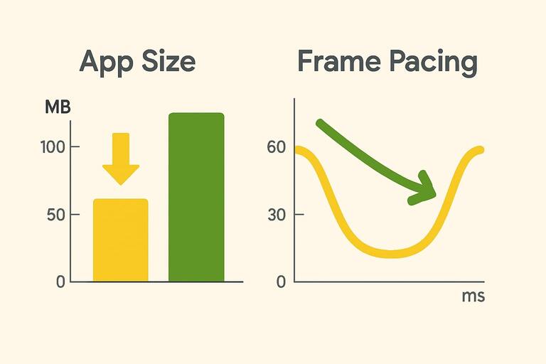
Asset budgets, texture atlases, and adaptive effects made the app gentle on storage and battery.
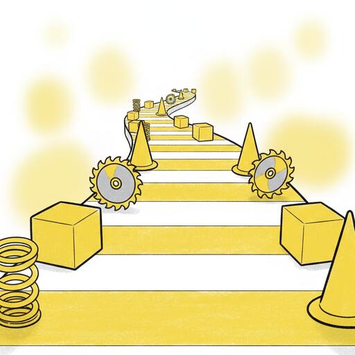
Under the hood, CluckDash favors clarity and performance. Here are a few choices that keep it light and fair.
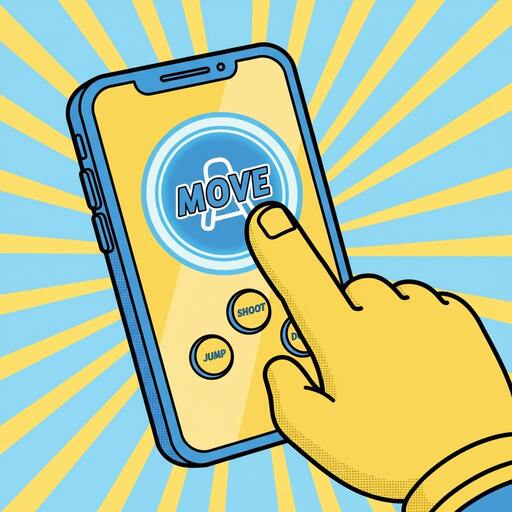
Large touch targets, forgiving swipe windows, and clean timing cues make inputs reliable.
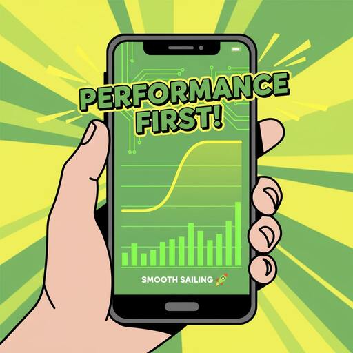
Frame pacing tuned, low overdraw layers, and adaptive effects to keep the run smooth on older devices.
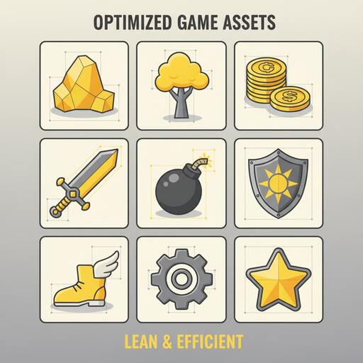
Tight budgets and shared palettes keep the app small without losing charm.
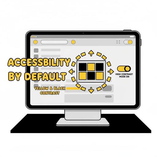
Visible focus, keyboard-friendly navigation, and motion-respectful effects out of the box.
A tiny crew that likes tidy loops, readable lanes, and smiles per minute.
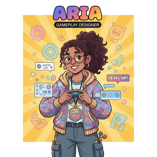
We tuned lanes for readable rhythms. The goal: make every dodge feel fair and learnable.
— Aria
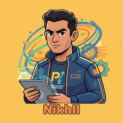
Texture atlases and careful frame pacing keep older phones comfy. Smooth first, fancy second.
— Nikhil
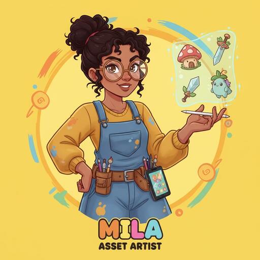
Clear focus rings, motion-respectful animations, and big tap targets by default.
— Mila
Clear promises we hold ourselves to — so your runs stay light, fair, and fun.

This is a free, simple game that requires no financial cost. No energy timers, no paygates.

Runs work without a connection. Progress syncs when you’re back online.
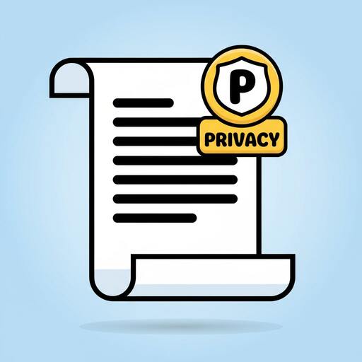
We collect only what’s essential to keep the run smooth and secure.

Optional and skippable; they never block your score or access to perks.
Logos, screenshots, and a one-page fact sheet for quick coverage. Free to use with attribution to CluckDash.
Primary/mono marks (PNG/SVG) and clearspace rules.
Curated set for articles and store features.
Key details: genre, platform, contact, and brand notes.
Usage: Please credit “CluckDash” and link to the homepage. Do not alter logos beyond scale or color variant provided.
We aim for comfortable play: visible focus, motion-respectful effects, readable contrast, and helpful labels.
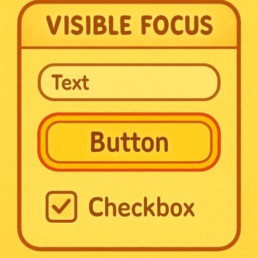
All interactive elements show a bold, high-contrast focus ring that’s easy to track.
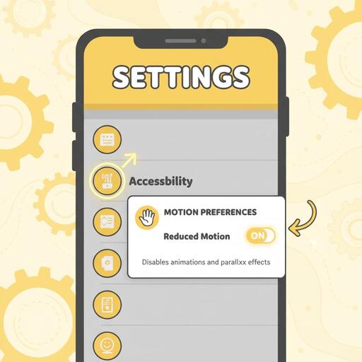
When prefers-reduced-motion is on, decorative effects pause and transitions simplify.
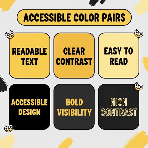
UI colors are checked against common guidelines to stay legible in bright and dim light.
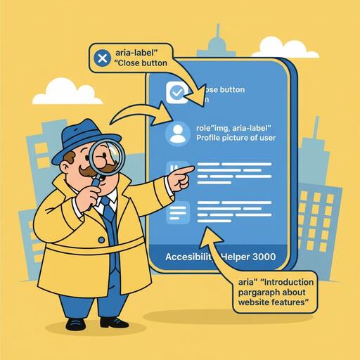
Meaningful aria-* labels and alt text provide context for assistive tech.
Need a hand, found a bug, or want to say hi? Drop us a line — we usually reply within a couple of business days.